
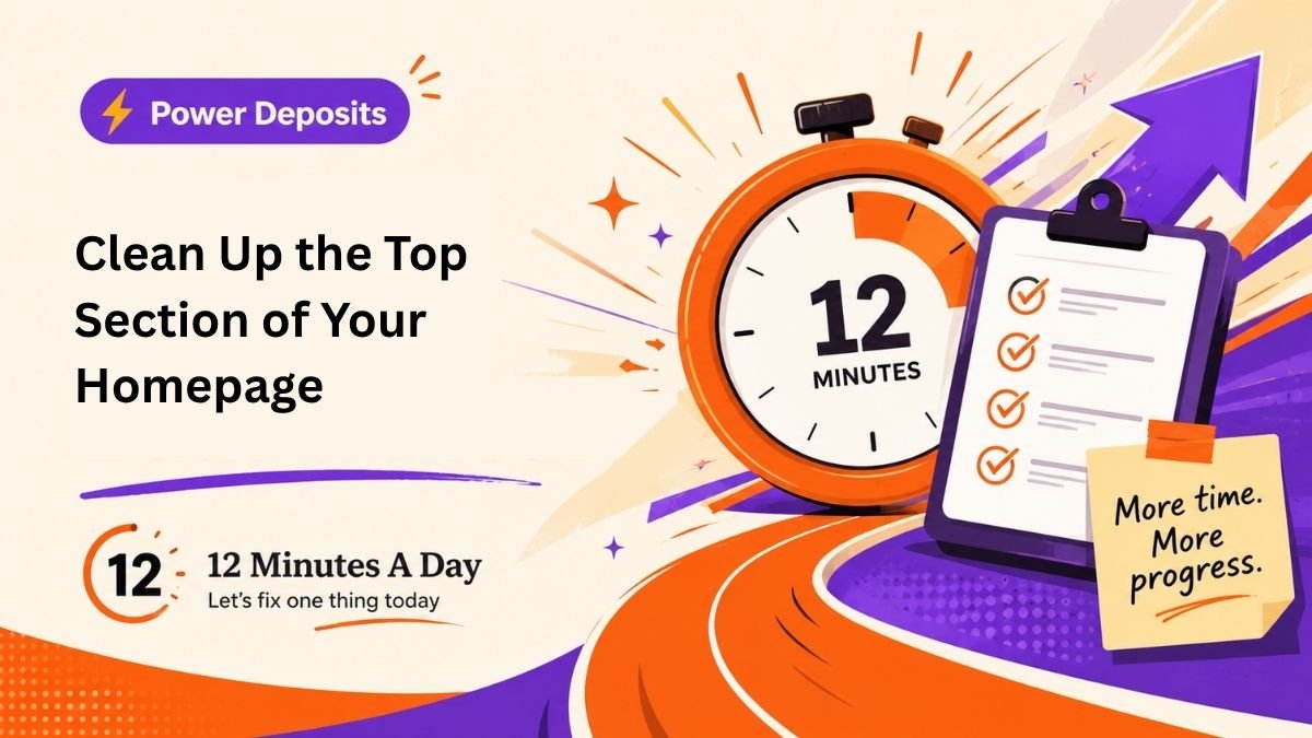
Weekend Power Deposit: Clean Up the Top Section of Your Homepage
The weekend deposit is bigger, but still contained.
Do not redesign your entire website.
Do not disappear into fonts.
Do not start comparing button colors.
Do not decide this is the perfect time to rebrand your entire life.
Clean up the top section.
That means the first thing people see.
Your homepage should quickly answer four questions:
- What do you do?
- Who do you help?
- Why does it matter?
- What should the visitor do next?
That is the job.
Not animation.
Not clever slogans.
Not a giant stock photo of people pointing at a laptop.
The top section of your homepage should give people confidence that they are in the right place.
Here is a simple structure:
Headline:
Say what you do.
Subheadline:
Explain who you help and what result you provide.
Button or CTA:
Tell people the next step.
Short support points:
Add 3 simple bullets that make the offer easier to understand.
Example:
Headline:
Errand Help and Home Check-Ins for Seniors in Venice, Florida
Subheadline:
Practical local support for groceries, pharmacy pickups, home watch visits, technology help, and everyday tasks that make life easier.
CTA:
Call or text to ask about availability.
Support Points:
Local Venice service
One-time or recurring help
Friendly, practical, dependable support
That is enough.
Is it perfect? No.
Is it clearer than what most people have? Probably.
This weekend, use what you created Monday through Friday and clean up the top section of your homepage, profile, flyer, or main online listing.
A redirected task still counts.
If you do not have a website yet, clean up your Facebook business page, Google Business Profile, LinkedIn page, Instagram bio, or one-page flyer.
The point is not the platform.
The point is clarity.
Weekend Power Deposit:
Use this week’s work to improve the first thing customers see when they find your business.
Prompt:
Can a stranger understand what I do and what to do next without scrolling, guessing, or decoding my personality?

